Fall 2009
In the magazine biz, the cover is often considered the most important page of an issue. It’s literally our pick-up line, as in, Hey, pick up this magazine! This one is near to Art Director Christopher Smith’s heart. “It was our first real delve into custom photography for the cover,” he says. (We used provided art before that.) And the warehouse setting was perfect for the arty subject matter.
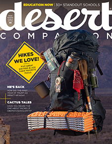
May 2013
You’ll need a closer shot than we can provide here to see why Smith put this cover on the list. It’s in the details. For example, the travel guides in the backpack’s pocket all refer to different stories within the issue, as do other small touches. It’s a subtle level of editorial integration that rewards readers who pay attention.
February 2014
Illustrating the notion of “best of the city” is an annual challenge. Three years ago, Smith met it brilliantly with this retro trophy shot. “This was the vision I had in my head the whole time,” he enthuses. It took the aid of a trophy maker, and Smith’s team scouring the city for items that could serve as, say, a donut. It worked. In a nod to his own sporty childhood, Smith gave the image an ’80s feel.
April 2014
This shot represents an experiment, something “we’d never seen in fashion photography before,” Smith says — projecting images behind the model, in a way that was artistic but still highlighted the clothing. The result is pleasantly ethereal. “The model appears to be floating above the headline and in front of the logo. It has an angelic quality.”
July 2016
“I had this idea in my head for I don’t know how many years,” Smith says. At long last, a year ago, when the editorial team finally highlighted barbecue, he was ready. Note how the model’s arms lead your eye to her eyes, which then bounce you to the main headline — it’s kinetic, neatly composed, gorgeously executed. Everything readers have come to expect from a Desert Companion cover.
00000184-2ffd-d624-afed-bfff0da90000 ... And one that almost was
January 2011
This issue’s theme was “Happy New You.” Which suggested to Smith a giant happy face: “It was perfect for the subject matter; the color, the smiling face — it just evoked the theme.” However, with this issue, Desert Companion was going monthly, and we ultimately felt a more traditional approach (below) would signal a seriousness commensurate with that frequency. Smith agrees, but kinda wishes the smiley face existed somewhere besides his computer archives. And now it does!


